


For many people, the only way to browse the internet is through their handheld devices. They might be reading an article on a website on their iPads at home, switching to a mobile phone during traveling, and later on, marking the important bits on a tablet at the office desk. The jump from device to device, device to desktop, and desktop to a laptop is typical in day-to-day life.
For websites, it becomes a challenge to serve the acrobatics required for multiple devices while providing the same level of user experience and intuitiveness. Design differentiation exists across mobile models, and in a few years’ time, the demand for even greater website responsiveness would require additional inventions.
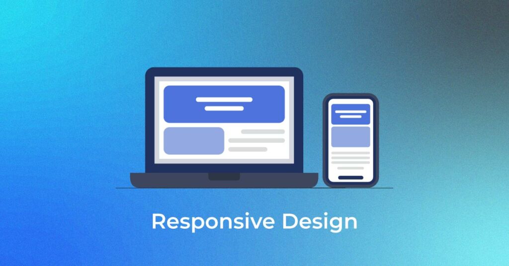
A responsive website will be a top web design trend today and in the future. If a website is as readable on a laptop as on a smartphone or tablet, it is a responsive website. But what does it take for a website to be called a responsive website? Let’s find out.
What is Responsive Web Design?
A simple answer to this question would be a website that allows browsing, usability, and readability across devices in response to the user’s behavior and environment. A website needs to have a responsive web design to respond to the size of the device screen, and resize and rearrange itself, including the images and text, accordingly.
The look and feel of the device needs to be the same across all devices, whichever you may use to view it. For a business that seeks to expand its horizons online, a responsive website is a must. SEO can be crucial to help make a website responsive and navigable across devices.

Why your business Needs a responsive website
A responsive website is a necessity for businesses today to connect with their users via many mediums and still afford the same user experience. There are many advantages of responsive web design.
Your SEO will increase
One of the benefits of a responsive web design is that it will improve your SEO score. An SEO-optimized website attracts more traffic and grants a better user experience and a lower bounce rate.
Google also ranks high such websites that are more responsive and have lesser loading times. Moreover, if a user has a good experience on your website, they will return, helping to maintain your site’s relevancy and establishing long-standing relationships.
It looks fantastic on every device
Another one of the benefits of responsive web design is aesthetic appeal. A responsive website will readjust itself to the screen of the device you are using. When the text and images are optimized for your mobile, laptop, and tablet simultaneously, the feel of the website is great, and it looks amazing.
It enhances user experience
In order to avoid clunky layouts that are hard to read and don’t look good, opting for a responsive website will enhance user experience. Users won’t be required to zoom in on text or read the information in bits and pieces. This is inconvenient, time-consuming and hampers user experience.
A responsive website, on the other hand, will help you provide a seamless user experience.
How to use Responsive Web Design
A responsive web design can be used to serve several purposes.
Web developers must give up being specific
Website responsiveness demands the need for web developers to move away from specifics such as pixel-related dimensions, absolute values, fixed positions, etc.
Instead of specificity, developers should opt for flexibility, where a website is able to adjust its proportions according to that of the screen. This would include resizing the images, repositioning the text, creating a new layout, etc.
Keep site load times in mind for responsive images
Page/site load times is another metric that Google uses to rank your website. Developers need to be mindful of site load times and ensure that images load quickly both on the laptop and smartphone. Developers need to balance quality against image size when they create a responsive website design.
Acknowledge that “responsive” and “mobile-friendly” are not the same
A mobile-friendly website isn’t the same as a responsive website. A mobile website is a custom solution different from the desktop version. At the same time, a responsive website will automatically accommodate itself to the varying dimensions of screens.
Keeping more versions of the same website isn’t useful for SEO, as both versions might compete against each other to rank in SERPs. The maintenance cost will be high, and the traffic will be divided between the two versions, hampering the reach and ranking of your website.
Since a responsive website is a singular entity, it will be low maintenance, you only have one address where traffic flows, and you opt for a smarter way to mark your presence online.
The theory behind Responsive Web Design
Ethan Marcotte wrote an article for A List Apart about the Responsive Web Design Approach. The idea behind responsive design comes from the concept of responsive architectural design. As per this concept, a room automatically adjusts to the number and flow of people in it at a particular point in time.
He writes, “Through a combination of embedded robotics and tensile materials, architects are experimenting with art installations and wall structures that bend, flex, and expand as crowds approach them.”
Based on the same approach, the article suggests adjusting screen resolution for a better responsive web design. Instead of creating a custom web design for each set of users, web designs should be able to adjust automatically for each category of users.
Each device screen comes with a different resolution, orientation, and definition. As we witness an influx of new models and designs, there is also a greater variation in size, functionality, and color that each new device can hold.
A user may wish to view in portrait or landscape mode and minimize or maximize screens at any given time. To cater to this, designers must develop web designs suitable for both landscape and portrait modes. However, this would require catering to the hundreds of screen sizes particular to each design. There’s no way to custom-make each design and keep them evolution-proof.
Hence, a handy solution can be to add flexibility to each dimension of the web design, including images, texts, layout, etc. Flexibility was limited for earlier websites but not anymore. There is a lot more a website automatically adjusts to, such as the images, workarounds to keep the layouts intact, fluid grids, fluid images, and smart markup.
Let’s depict a showcase of responsive website design to better understand how it is done.
A Showcase of Responsive Web Design
We already discussed how adding flexibility to each element in web design can be a great solution over custom-built designs for each new device and model. Let’s understand the intricacies of a responsive web design via a sample web design.
#Flexible images
Images play a big role in adding dimensions and structure to the website layout. A disproportionate image can cause the design to go unwieldy. There are several ways to add fluidity to your images by resizing them proportionately.
For instance, by setting the maxim width of the image to 100% of the screen or browser, you can program the images to shrink in response to the size of the screen. Instead of declaring the height and width in your code, you let the browser resize the images by using CSS (cascading style sheets) to guide their relative size.
#Custom Layout Structure
While most of the custom layout styles can remain the same, in case of extreme changes, there is a need to change the layout entirely. The changes can be brought through a separate style sheet or CSS media query. Mostly, style sheets inherit these styles and move elements around accordingly.
When a default style sheet which has all the elements of the layout defined, doesn’t respond properly to the switch, such as making the layout too narrow, the responsive website shifts to the new style sheet automatically.
#Showing/Hiding Content
Beyond the capabilities of shrinking and rearranging content, websites need another option to follow best practices for mobile environments, such as simple navigation, more focused content, etc.
A flexible layout will be able to hide and show content, so the user is able to pick and choose content. CSS has been successful in making this feat possible by allowing users to read selective content in the mobile version and vice versa.
#Touchscreen vs. cursors
Besides smartphones, touchscreen laptops are also easily becoming common these days. They come with different guidelines than cursor-based devices and have different capabilities as well. Implementation of a responsive design that works for both is easier and doesn’t impair any usability either.
Here are a few examples of responsive web designs:
Image Link 1 Image Link 2
#1 Art Equals Work
It is a great example of the many responsive web designs in prevalence today. The first screenshot shows the standard computer screen dimension with flexible browser widths. Once the browser is narrowed too much, the layout shifts to a more readable one, with sidebars disappearing, enlarged texts, and navigation going to the top.
Image Link 1 Image Link 2
#2 8 Faces
The flexible website design of 8 Faces can adjust to a standard netbook or tablet and expands in quantity and layout when viewed on bigger screens. When we narrow down the screen, the website readjusts the layout to cut out the featured issue and shorten and rearrange the content, leaving out unnecessary information.
Image Link 1 Image Link 2
#3 Hicksdesign
The browser layout for a traditional desktop screen has three columns. When the browser is minimized, the third column moves above the second, and the logo settles itself next to the intro text. For narrower widths, the sidebar is entirely removed for a simplified version. The font size also changes in sync with the size of the screen. For the smallest version, the navigation becomes a drop-down menu to save space.
Conclusion
A responsive website transitions into new dimensions each time a user changes their device and still looks appealing. By creating a seamless user experience, a responsive website design helps users consume information easily without time-consuming and annoying pinch-ins and zoom-outs.