


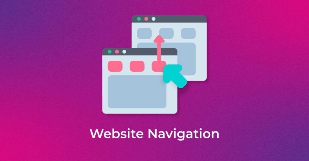
Whenever a website is built, what is one of the first things a developer should keep in mind? The answer is website navigation. How seamlessly a user can navigate through a website can impact their overall impression of a website. As backed by research, website navigation impacts the impression of over 90% of the consumers.
It is quite easy to grasp why website navigation plays such a big role in user impressions. It allows the visitors to quickly access the information they are looking for and even access information relevant to their searches they were not even looking for! This can include information like pricing plans relevant to their needs, blogs, emails, forms, signup pages, and much more.
This makes one thing very certain — user experience is highly dependent on how good your website navigation is. A good navigation system should allow users to obtain the utmost convenience and assistance in their user journeys. This can even improve the chances of conversions or targeted actions on your website.
What is Website Navigation?
When developing a website, the collection of various components of user interfaces and how they help users in their journey is what website navigation is at its crux. There are many types of website navigation and each component factors into how it can improve the user journey.
These components can be anything, from a call to action button to menu items. Menu items are one of the most important components of a website. The navigation menu on your website can contain an organized list of all the landing or pillar pages on your website. They can even have subcategories for other internal pages of relevance to the users. Menu bars are usually placed on the page header space, or sometimes on the sidebars for easy user access. This helps users in accessing the most useful pages on your website in an instant.
However, that’s not the entirety of what website navigation is. It also plays a key role in creating a spiderweb of connection within all your internal pages. It helps search engines in understanding the relationship of all the individual pages on your website.
What is a Navigation Menu?
An organized bunch of links that guide the user to various pages on a website—usually internal pages—is called a Navigation Menu. Since websites do not actually have any form of physical structure, they must have a solid, structured menu. The most common types of website navigation are to present links horizontally across the page header, or as a list in a sidebar. A good navigation menu can help users easily reach their intended destination on the site without getting lost in an unending array of disconnected links. Browsers make use of this navigation menu bar to help users navigate the file system.
What is Sub-navigation?
Sub-navigation is a user interface that provides access to the lower-level categories of the site’s information architecture. Sub-navigation or local navigation refers to a list of sub-categories present under the main navigation links. Sub-navigation links in the user interface allow visitors to access other related information directly from the main page—with very few mouse clicks. These links help users access pages that are buried deep within the site’s architecture. A website should have a good sub-navigation system that forms a hierarchy and links various pages in the website.
Importance of Website Navigation
Have you ever strolled through a website only to get lost in the maze of information with nowhere to go? If yes, then you have undoubtedly experienced the horror of a poorly designed navigation. Poor navigation not only makes a user abandon the site but also leaves them unsatisfied. A simple navigation structure might help visitors quickly find the information, without breaking the chain. It can result in user satisfaction and better conversion. Moreover, the user feels good when they are in control of their seamless journey through the website.
Having a well laid-out navigation also helps search engines to discover and crawl more pages on the website. It could result in an increasing number of indexed pages. Increasing the number of indexed pages for the client is imperative for any SEO company in India.
Connection Between Website Navigation and User Experience
The structure of a website and how well it is architectured plays a key role in determining the user experience of your website. Website navigation is perhaps the most crucial element of building a website. It offers users a seamless user experience through their journey.
How easy the website is to use and how easily a user can navigate through it are two determining factors of user satisfaction. Hence, you must improve website navigation from a user’s perspective so that you can identify how the user experience can be made even more seamless. How long a customer stays on a website is a testament to its convenience and the content it offers. Therefore, while building a website, you must ensure that the user gets the maximum results for minimum effort.
Different Types of Website Navigation
Websites most commonly use one of the three types of navigation structure for maximum efficiency, which we are going to discuss below.
-
Hierarchical Navigation
Hierarchical navigation is the most favoured navigation structure, especially for big e-commerce websites. It has a top-down approach. The top consists of general pages and bottom ones are more specific pages in a hierarchy.

-
Global Site Navigation
Global site navigation is the navigation structure designed to be present on all the pages of a website such as a header and a footer navigation bar. They mostly represent the top section or essential pages on the site.
Header Link

Footer Link

-
Local site navigation
Local site navigation are mostly links embedded in the content leading the visitor to discover more related pages on the site. It effortlessly drives the user to the resources for which they are visiting a particular website.
-
Hamburger Navigation
Hamburger navigation might sound mouthwatering, but it is an intriguing type of website navigation. This type of menu is usually used on mobile Web pages. When the phone screen is large, the items on the menu are presented horizontally, and when the screen is smaller, the list collapses behind a three-lined button. This three-lined button is called the hamburger button, and it is most beneficial when implemented on a screen with space constraints. The hamburger menu is a globally accepted icon that indicates that a list of items is present behind the button.
-
Vertical Sidebar Navigation Menu
In vertical sidebar navigation, a list of menu items is presented vertically, under one another, on either side of the page. Although it is not one of the most popular types of website navigation, it still offers several advantages. Placing the menu list across the header might cause problems due to the limited real estate on a Web page. On the other hand, by stacking the links one on top of the other, we can put in a long list and can prioritize pages by putting the most important ones at the top, and using the above-the-fold area. Since the orientation of the sidebar is not confined by space, you can easily add more items to the navigation list.
Features of a good website navigation
In the real world, every business does not sell the same product or service, nor do they have the same sets of customers. Even the business goals are unique. Some might have transactions as their goal while others have signed up for a newsletter as their primary goal. One cannot have a “one size fits all” strategy for all the websites. This could hurt the website traffic.
A rule of thumb in SEO is that no matter on which page one is, the entire website should be accessible from three clicks from the current page.
Good website navigation largely depends upon the combination of three factors. Having a thorough understanding of the elements could help formulate an optimal navigation strategy for a website. These three factors are:
- Users
- Business
- Goals
Understanding users and anticipating their navigation journey can help in defining clear and appropriate links on the website. This could significantly enhance the user experience of the site leading to more conversions and sales on website.
Now that we know how good site navigation leads to a positive effect on the business, let us see how to improve website navigation.
How to Decide on What Your Website Navigation Bar Should Include?
-
Card Sorting Technique
A simple and commonly used user experience technique, card sorting can help you in getting into the mind of your visitors and offering them navigation that they would need.
Have a test audience or invite some people who are not from your organization for a simply laid-out exercise. Just present a stack of various index cards to the test audience. Each card should represent a major internal page on your website. Then, ask your participants to organize or segregate these cards in any order of their preference. This simple activity can help you in finding common organizing trends within your participants, like how they are grouping the pages on your website, which ones they prefer to be first, which ones are becoming subcategories, and more. In the end, ask the participants to name each major category. This can help you in building the spine of your website skeleton.
-
Attribution Reports
Attribution reporting is where things get technical. If you use analytics software, it can provide you with attribution reports for making a decision about the pages going into your website’s main navigation.
Attribution reports highlight the number of new leads, and how they are interacting with your website. This helps you in attaining deeper insights into how the content and functionality of your website is converting the visitors into leads and leads into paying customers. This can help you in finding out which pages should be given the limelight based on how much of an impact they are having on the users’ decisions.
-
Users Flow Report in Google Analytics
If you do not use any analytics software to generate attribution reports, there is still a way to gain valuable insights about your users. Google Analytics has a feature that generates User Flow reports. These reports provide you with data related to the paths users take through your website. This starts right from the source of where they came from, which was the last page before they closed your website on their browser.
User Flow reports can be a great indicator of pages that are retaining a visitor’s attention, and the ones which have higher bounce rates. This can help you in improving your website’s navigation by optimizing pages with high bounce rates and leveraging the ones on which visitors are spending the most time on.
How Can We Choose Navigation?
-
Object-Based Navigation
Object-based navigation is a type of website navigation in which content is placed under defined and concrete categories. For instance, a college website would have all the relevant categories on its menu bar, such as Programs, Academics, Admission, Campus Life, etc. Notice that each of these categories will generally have groups of subcategories within them with internal pages that best fit the category.
-
Action-Based Navigation
As the name suggests, action-based navigation encourages the users to take an action. To carry forward the previous example, the main categories on the menu bar of a college website would also include action-based links like “Contact Us” or “Fill a Form”.
Users coming to your website with an action in mind should be offered action-based navigation. This can be easily figured out by asking your visitors their purpose of visit on the website. So, when a user says they are coming to your website with an action in mind, serving them navigation to the “About Us” page would not be a good idea. Instead, offer them actionable links such as “Apply”, or “Fix an appointment” or “Book a Session”.
-
Audience-Based Navigation
If your website has an audience base with diverse users, then audience-based navigation is the best approach. In simple terms, audience-based navigation offers different types of features on your website to different types of users. The user can select which segment they belong to, and the website version presented to them will have navigation built for them.
The tricky side here is that the user has to correctly identify their segment in order to access this type of navigation. For instance, a college website can have the option on their menu in the form of an “Information For” button, where various user segments like Students, Faculties, Parents & Guides, Alumni, etc., can be present. The user can click on the one which fits them, and the website navigation offered to them will be based on their choice.
-
Search Engine Optimized Navigation
It is imperative that your website obtains the best regards from search engine algorithms. Hence, search engine optimized navigation is equally important as the other types. This can be done in various ways. For example, you can use tools like Google Analytics to see which search terms are bringing in the most traffic to your website, and use the variations of those search terms as a guide to optimizing your website navigation
Website Navigation Example
While many websites boast of excellent navigation capability, Mailchimp is the one that we will talk about here.
Mailchimp offers a seamless and straightforward navigation experience to users. It is an example of how you do not have to use every tip and trick in the book to get visitors to your doorstep. The Web page comes with a sticky navigation bar on the top of the page—quite useful when you are scrolling down the home page (and it’s a long way down, anyway). The subcategories of the main menu appear when you hover near the list, and they disappear as you move back – sleek! The subsections look something like a sidebar navigation menu would, making the entire look of the website quite interesting. Finally, the fat footer is, well, fat. It manages to fill up a whole page. But the content is not overwhelming. The information on the footer seems to be in sync with the look of the entire site. The whole website looks sleek and, at the same time, a bit quirky. The navigation is elegant, and the use of a lot of negative space makes the site attractive.
And if you have not hovered your mouse pointer on the logo of Mailchimp yet, we recommend that you do so without wasting any more time! The cute little monkey animation is undoubtedly a nice touch!
Website Navigation Best Practices
-
Links to Homepage
Each page on the website must contain a link to the homepage. It could be from the logo, other content page or footer. Users tend to return to the homepage once the information is consumed. The homepage acts as a central place, from where users can navigate to different regions on the website with ease.
-
Mobile-friendly Navigation
Mobile-friendly navigation is essential for good user experience and also for indexing of pages. Since July 2019, Google has moved to mobile-first indexing, i.e., it will rank pages based on the mobile version. If the navigation on the mobile site is complicated and confusing, it might lead to a lousy user experience, affecting the indexing of pages.
-
Keep consistency
Keeping the form and placement of links consistent on a website increases the likelihood of user engagement. Constantly changing links can frustrate and irritate the user leaving them unsatisfied and in a confused state.
-
Relevant Title
The clickable elements on the page should have a clear, self-explanatory title. Such a title communicates the type of information a user will encounter once he clicks on the link. Similar to constantly changing links, a clickable link leading to an unrelated page could also agitate the user and possibly create a lack of trust.
-
Clickable Links
Make sure all the clickable links found on the website are correctly functioning, even the links from the drop-down menu of the header section. Most of the time, users directly go to sub-category pages from the main menu. Hence these pages should be highlighted and accessible.
-
Search Box
Placement and search box features are essential for a better user experience. The placement of the search box should be highly visible to the user. When a user searches, it should always return relevant results. Even if the product is not available, it should at least display the most closely related product. Showing no results could discourage users.
-
Breadcrumbs
Breadcrumbs indicate where exactly one is on the website. It adds convenience and control to navigation. It enables users to navigate back to any other page in the user journey with the help of a single click.

-
Image links with Alt text
Using Alt text is a good practice, but more so if the image is a part of navigation. Having a descriptive Alt text helps the user to recognise which page the underlying link is going to lead. It also helps visually impaired users to navigate the website easily.
-
Footer
Footers are mostly used to link privacy and legal pages, but can also be used to link essential pages of the sites. Websites such as e-commerce sites have heavy content and have made most use of this space by linking to high-value pages on the site.
-
Use Call to Action
Using the right Call to Actions on the website can improve the click-through rate and user engagement. CTA encourages the user to take desired actions such as filling up of a form or signing up for website newsletter; thereby aiding to better conversions and sales.
-
Create Obvious Hypertext
The design of a website must not be in the way of its usability. The user must be able to distinguish between normal text and hypertext easily. Make sure that the hypertext is formatted uniquely and is different from the other elements on the Web page. For instance, you can use a different font style or font colour, underline it, and so on.
-
Keep the Sidebars Separate
You must ensure that the sidebar is its own entity on a Web page. Keep it separate from the rest of the content. Make it stand out by using a background colour that is different from the remaining portions of the Web page. This can help the user identify the part of the Web page that they should concentrate on. It is also important to ensure that the other elements of the page are far removed from the sidebar, so they do not blend.
-
Insert Your Navigation in the Required Place
While a creative website will be appreciated, there are certain elements of a Web page that the users expect to be at a defined, fixed place. Search bars, header navigation, sidebars, and so on need to be in the place designated to them. This is an industry practice and is true of all websites.
-
Order of Your Website Navigation is Important
While navigating a website, it is imperative to provide users with all the pages they have opened in a navigation bar in the order that they were opened. Usually, the Web pages at the beginning and the end are the most important ones. Another way to maintain the order of navigation on your website is to provide users with the most important parts of the website in the most accessible place on the website.
-
Connect the Navigation with Business Preferences
To ensure maximum conversion of the visitors to your website, it is important to highlight your business priorities. Directing visitors to the particular Web pages where they can buy your products/services while important, should be done in the right way. This can be done by creating a balance between serving the visitor’s curiosity and adding the links of the Web pages relevant to customer engagement, such as the Contact Us or About Us pages.
Measuring and Changes in the Navigation structure
Optimising websites to improve navigation is a continuous process. You have to continuously keep track of user behaviour on the site, especially user journey and heat map reports. User journey can highlight the pages from where users are dropping off, whereas heat maps reports can provide valuable insights about the user interaction on the page. These information hints at the likeability of particular features after the UI, UX changes on the website.
Website navigation plays a significant role in the success of business online. Often it is the most overlooked part of the web development process with design and multimedia taking all the credit for a successful website. Sometimes developers have a hard time understanding importance of website navigation. Optimising navigation structure for a smaller site by implementing an on-page SEO technique is simple. However, more significant sites might need to hire SEO services to resolve the problem related to poor navigation structure.

2 thoughts on “Website Navigation: What It Is & How to Design It Right”
Thank you for giving useful information.
Thanks. Do subscribe us for more updates.