


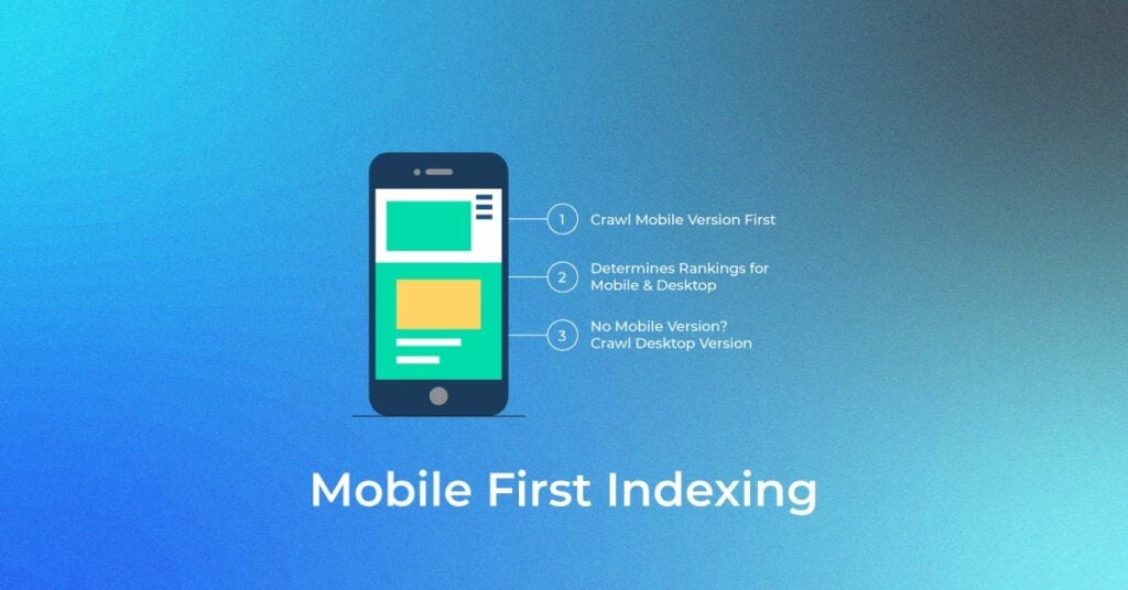
There has been a lot of discussion about mobile-first indexing and how Google now prioritizes the mobile version of websites. In this post, we will explain what mobile-first indexing is and how it impacts your website’s performance in search rankings.
What is Mobile-First Indexing?
Mobile-first indexing means that Google now uses the mobile version of your website as the primary version to rank and index content. With the shift in user behavior toward mobile devices, Google mobile first index became the default starting in July 2019. By May 2023, all websites were switched to this indexing method.
Since Googlebot crawls websites using a smartphone user agent, it is essential that your mobile version is optimized for content, performance, and user experience to ensure that your website ranks well in search results.

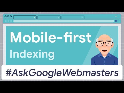
Check out this video to know more about Mobile-First Indexing
Impact of Mobile-First Indexing on Different Website Versions
Mobile-first indexing impacts websites differently based on how they serve mobile content. Here’s how each type of website is affected:
Responsive vs. Separate Mobile URLs
For responsive websites, the same URL serves the same HTML across all devices, with layout adjustments made via CSS. These websites are ideal for mobile-first indexing, as Googlebot only needs to crawl one version the mobile layout. This makes responsive websites a great choice for ensuring your content is easily crawled and indexed.
On the other hand, websites that use separate mobile URLs (like example.com for desktop and m.example.com for mobile) will have the mobile version prioritized for indexing. It’s crucial that the mobile version contains the same meaningful content, structured data, and metadata as the desktop version to avoid SEO loss.
Dynamic Serving Sites
In dynamic serving, the site uses the same URL but delivers different HTML and CSS based on the device. With mobile-first indexing, Googlebot primarily crawls the mobile version, so it’s important to ensure that the mobile-delivered content is fully equivalent to the desktop version.
For all website types, consistency in structured data, meta tags, and internal linking across versions is key to maintaining visibility in search results.
Mobile-First Indexing Checklist: Key Optimization Areas
To stay competitive with mobile-first indexing, it’s essential to optimize key areas of your website. Here’s a checklist of things to focus on:
Ensure Google Can Access and Render Mobile Content
Google highly recommends that a mobile website uses the same meta robots tags as the desktop version. This ensures that Googlebot can easily render your content. Avoid lazy-loading issues, as Googlebot can’t crawl content that requires user interactions.
Ensure That the Content is the Same on Mobile and Desktop
While the design may differ for mobile devices, the content should be the same across both versions. Having equivalent content ensures mobile-first indexing doesn’t result in SEO loss, as consistency is crucial for ranking.
Check Structured Data on Mobile Pages
Ensure that your structured data on mobile pages is identical to the desktop version. Whether using VideoObject, Breadcrumb, or Product schemas, consistency is vital for proper indexing. If you’re using Google mobile first index, make sure the URLs in your structured data match the mobile URLs.
Optimize Visual Content (Images and Videos)
Visual content, such as images and videos, plays a significant role in SEO for mobile-first indexing. Make sure that both images and videos on your mobile site are high-quality, use supported formats like JPG, PNG, and SVG, and have consistent alt text for SEO and accessibility.
Avoid using dynamic or changing video URLs on page reloads as it hinders Googlebot from indexing videos correctly. Also, ensure the video structured data is the same across mobile and desktop versions.
Improve Mobile Page Speed and Core Web Vitals
Mobile page speed is a critical ranking factor in mobile-first indexing. Sites that load slowly can experience higher bounce rates, affecting their rankings. Optimize Core Web Vitals specifically LCP (Largest Contentful Paint), FID (First Input Delay), and CLS (Cumulative Layout Shift) to ensure a smooth mobile experience. Use PageSpeed Insights, Lighthouse, and Search Console for regular performance checks.
Technical Considerations for Mobile Indexing
Several technical aspects must be considered when optimizing for mobile-first indexing. These factors can impact how Googlebot crawls and indexes your site.
1. Robots.txt and Mobile Crawling
Make sure your robots.txt file does not block important mobile resources like CSS, JavaScript, or images. Googlebot needs access to these resources to render your pages correctly.
2. Metadata Consistency
Maintain consistency in your title tags, meta descriptions, and meta robots tags across both mobile and desktop versions. This ensures Google receives consistent signals, which helps your site rank equally well on both versions.
3. Canonical and Hreflang Tags
Ensure your mobile and desktop versions use the same canonical tags and properly implement hreflang tags to indicate the preferred version of your content. This is crucial for global SEO and prevents content duplication issues.
4. Use of Responsive Design and Mobile-Friendly Layouts
Adopt responsive design to ensure a seamless experience for users across all devices. This is the most effective way to ensure Googlebot crawls and indexes your content properly. It also Use Google Search Console for Mobile Usability
- Core Web Vitals Report: Tracks metrics like LCP, INP, and CLS for mobile users.
- Page Indexing Report: Shows which pages are indexed and flags issues like crawl errors.
- URL Inspection Tool: Lets you test how Googlebot (mobile) views and renders a specific page.
Identify and Resolve Mobile Errors
Use the Index Coverage and Core Web Vitals reports to monitor mobile errors such as blocked resources, poor page load speeds, and inconsistent content between mobile and desktop. Resolving these errors is essential for maintaining optimal indexing and SEO performance.supports mobile-first indexing best practices.
Monitoring and Fixing Mobile Indexing Errors
Regular monitoring is essential to ensure your website stays optimized for mobile-first indexing. Google Search Console provides valuable insights for mobile performance:
Use Google Search Console for Mobile Usability
While the Mobile Usability report has been retired, Google Search Console still helps track mobile performance through tools like:
- Core Web Vitals report – Tracks metrics such as Largest Contentful Paint (LCP), Interaction to Next Paint (INP), and Cumulative Layout Shift (CLS) for real users on mobile.
- Page Indexing report – Shows which mobile pages are indexed and flags issues like crawl errors or blocked resources.
- URL Inspection tool – Lets you test how Googlebot (mobile) views and renders a specific page.
These tools help diagnose mobile indexing issues that can affect SEO visibility.
Identify and Resolve Mobile Errors
Use the Index Coverage report and Core Web Vitals report in Google Search Console to monitor crawlability, loading performance, and rendering issues. Key mobile errors to watch for include:
- Blocked resources (CSS, JS, images)
- Poor Core Web Vitals (e.g., slow LCP, high CLS)
- Inconsistent content between desktop and mobile
Promptly resolving these helps maintain healthy indexing and optimal rankings in mobile search results.
Google’s Updates on Mobile-First Indexing
Google mobile first index became the default for all websites in May 2023. The shift from desktop-first indexing ensures that mobile content is prioritized for crawling and indexing. While mobile-first indexing itself isn’t a direct ranking factor, mobile performance and usability significantly influence SEO, including Core Web Vitals.
Conclusion
Mobile-first indexing is a long-term shift in how websites are evaluated and ranked by Google. By ensuring your site is optimized for mobile, maintaining content consistency, and focusing on mobile performance, you can improve rankings and provide a seamless user experience. Staying updated with Google’s mobile-first index guidelines and regularly auditing your mobile site ensures continued SEO success.
FAQs
How to check mobile first indexing?
You can check if your site is on mobile-first indexing using the URL Inspection tool in Google Search Console. Enter any page URL, and under the “Crawled as” section, it will show whether Googlebot Smartphone or Desktop was used.
How do I check my indexing status?
In Google Search Console, go to the Page Indexing report under the “Index” section. It shows which pages are indexed, which are not, and provides reasons for any indexing issues. You can also inspect individual URLs using the URL Inspection tool.
Quick Tip: You can also use the Google site: search operator to see which pages are indexed. Just type site:yourdomain.com into Google Search to get a view of your indexed pages.
What is AMP in SEO?
AMP (Accelerated Mobile Pages) is an open-source framework designed to load web content faster on mobile devices. While AMP pages were once favored in Google’s Top Stories, AMP is no longer a ranking requirement and is not specifically prioritized in mobile-first indexing as of 2024.
Does Google prioritize mobile-first indexing?
Yes. As of May 2023, Google uses mobile-first indexing for all websites. This means it prioritizes the mobile version of your content for crawling and indexing. However, mobile-first indexing is not a ranking factor, but having a well-optimized mobile site can influence other signals like user experience and engagement.